
XING Design Language
Pitched and led XING’s Design Language (XDL) — grew into a system serving 300+ internal users across ~30 product teams, still in active use today.
Role
Design lead
Timeline
2019
Discipline
Design language
Scale
300+ users · ~30 teams
In short
XDL began as a grass-roots proposal to unify a tired and fragmented UI across XING’s three platforms. I pitched it — scaling buy-in from close allies up to a final C-level session, where the CEO’s answer was simply “go for it” — then led it from a set of design principles into a living system now embedded across ~30 product teams.
The challenge
XING’s core interface hadn’t meaningfully changed since the company’s founding in 2006. Three platform teams — iOS, Android and Web — worked from local design decisions with no shared visual grammar, and brand work happening outside the product wasn’t translating into the digital experience. Product teams got contradictory decisions and direction when designing their products across three platforms, and production slowed.
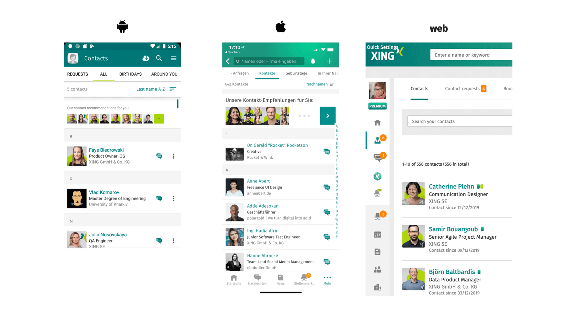
Before: the design was old, tired and misaligned across the three platforms
Approach
I started experimentally — hack weeks and monthly “Fixee Fridays” to lay the groundwork and draft a set of design principles. That earned a dedicated three-week sprint with a passionate five-person team. The sprint was structured as brainstorm → refine → share-out.


We set Design Principles to ensure we were conscious in direction and rooted in the identity of the product
To build support and engagement we presented the chosen direction as a “Blick unter die Motorhaube” (a look under the bonnet) sessions — immersive, gallery-style walkthroughs of the principles and sketched-out concepts. This was inspired by Johnson Banks’ open rebrand of Mozilla — scaling from closest allies up to the C-level.

“We built a wall” to showcase our ideas and design concepts

We replicated the physical wall in digital format and shared widely
I kept the system deliberately small: five elements — buttons, typography, the superellipse avatar shape, colour and iconography — were enough to transform the feel of the product across all three platforms.
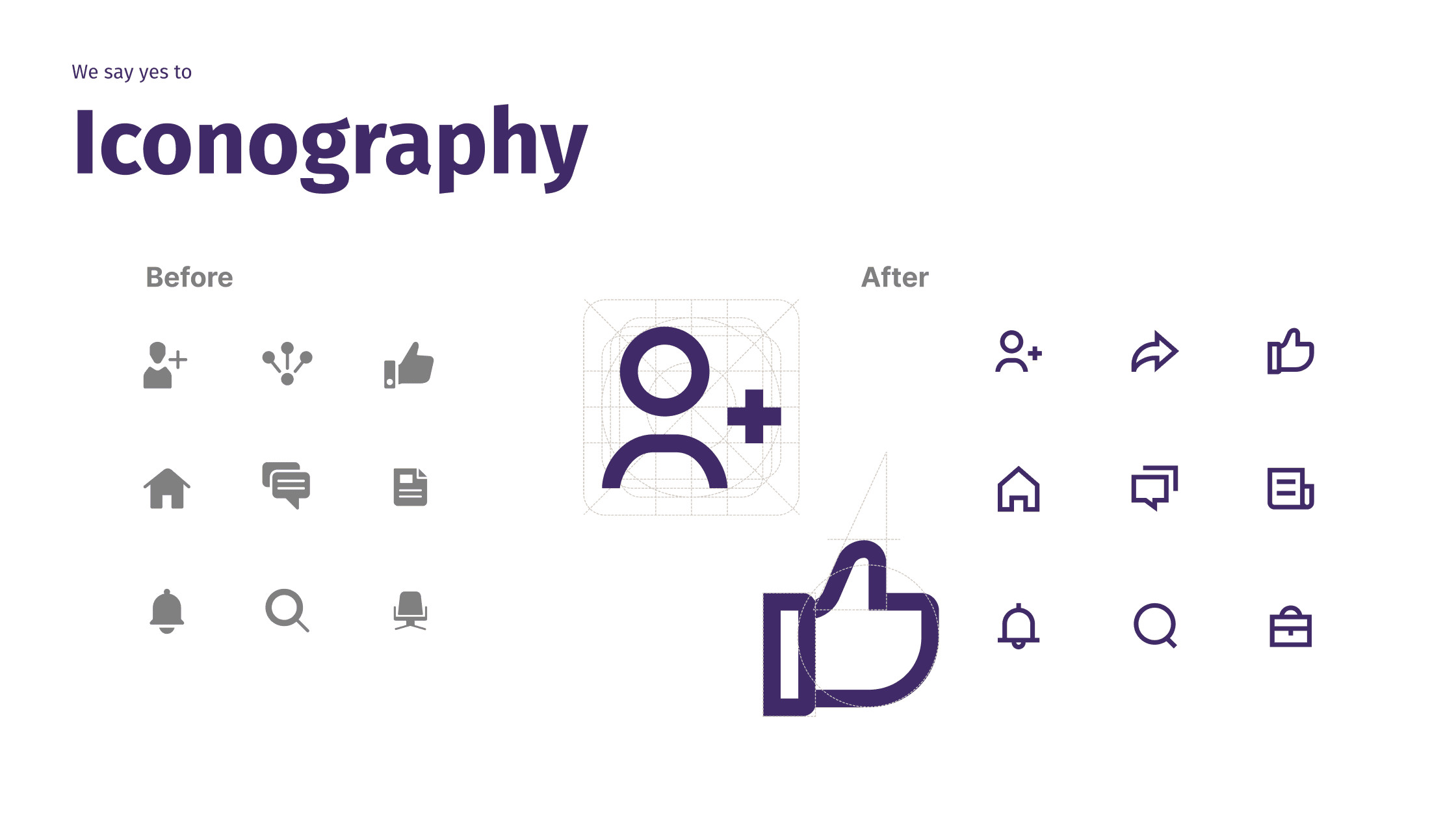


Updating a handful of key design elements were enough to transform the product design into a modern direction

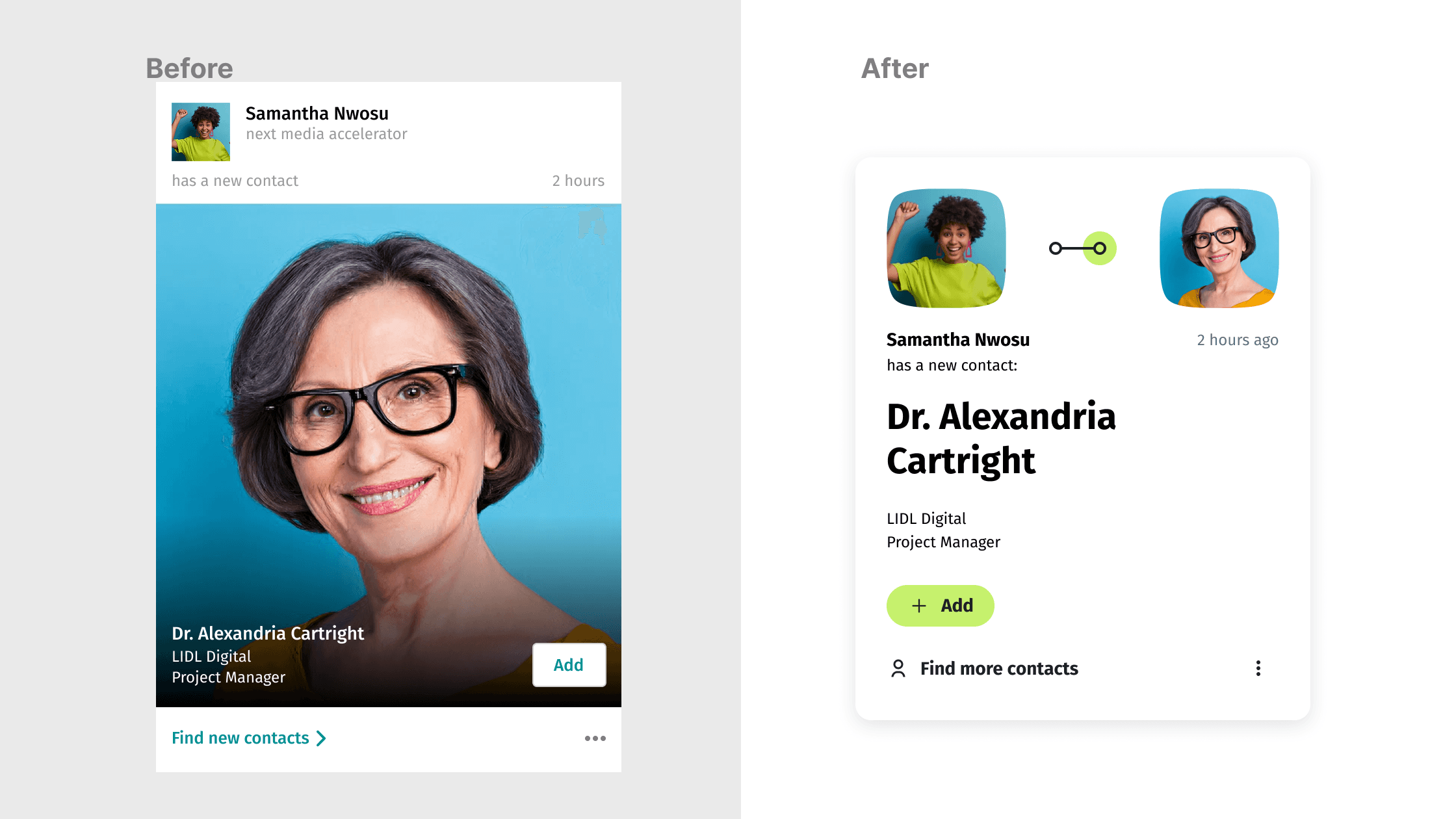


We played changes through key features and touchpoints in order to test its robustness
Applying the new design to the most used pages was queued up with a major re-launch. In order to not fragment the experience, we also planned a concerted 'face-lift' effort to update the long-tail and keep the design cohesive across all pages.
Outcome
A single design language went live across iOS, Android and Web as part of a major release at the end of 2021 — and it’s still in active use today.
Switching the new design on the Jobs landing page lifted job searches by +20% overnight, and a 200+ illustration library let other teams extend the system without design bottlenecking every request.

We produced a set of key visuals to set direction
What I’d do differently
Buy-in for the pitch came quickly — helped by timing, with a management reorg landing just as leadership was looking for a directional shift. The harder, slower work came after: holding the language’s integrity as it rolled out across every touchpoint on the live product.
One misstep — going to market with an illustration style our new CPO felt wasn’t serious enough — triggered a fast rework, after which I introduced monthly stakeholder syncs to catch that kind of misalignment earlier.


